Harbor seals, Tillamook Head, kayaking, crabbing and more
Published 5:06 am Thursday, February 1, 2018
- Seaside has selected consultants to deal with issues at the city’s wastewater plant.
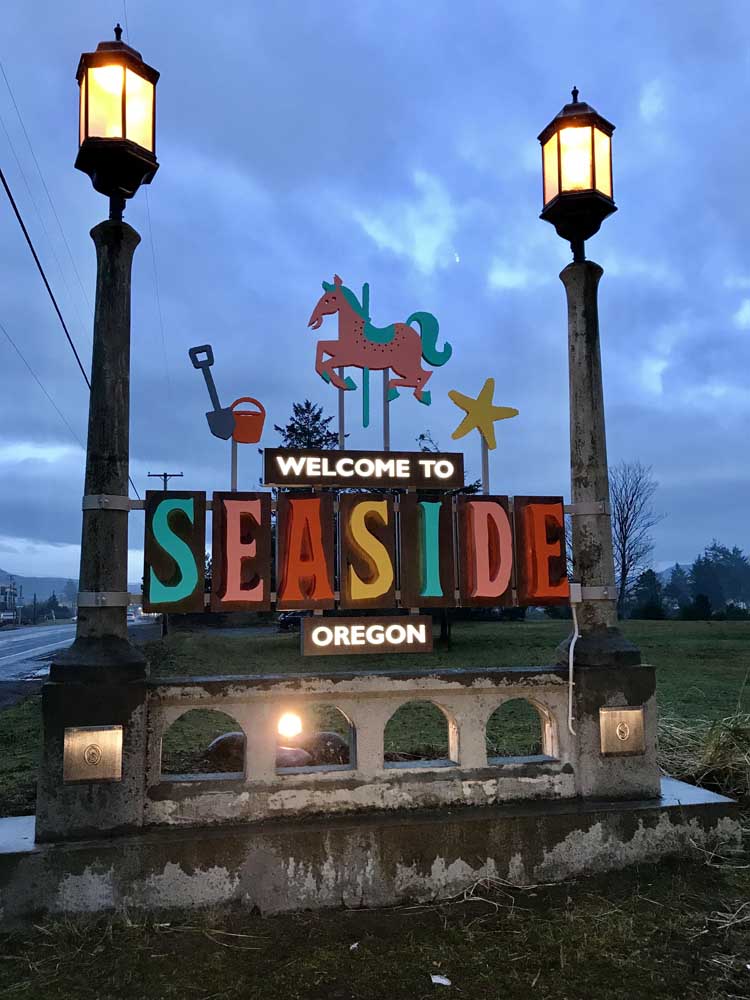
You’ve likely driven into Seaside, arriving from the north or the south, hundreds if not thousands of times. The entry signs into Seaside may have never struck you as a storytelling element for our town, but that’s exactly what we’re trying to do with the new branded signs that were installed the first week of January.
Have you seen them? What was your initial reaction? As with any project that brings change, there will be voices on either side of the spectrum – some that love it, some that dislike it. They’ll even be those that don’t have an instant reaction, but just need some time to get used to the new addition to our town.
The new Seaside signs project comes a little more than two years after we reimagined Seaside’s image, the visual identity that we use to market and advertise a community that became a tourism destination nearly 150 years ago. Back then, Ben Holladay built an Italian-style villa on the site of the Seaside Golf Course in 1871 to help attract those living inland to visit here. Today, we use a number of methods to encourage visitation to a community where one in three jobs is tied to tourism and hospitality, and tourism is a critical driver for our town’s economic vitality. The entry signs are just the latest in an effort to amplify the rebranding work we started two years ago.
In 2015, I wrote about the complete rebranding we’d just finished. It’s easy to Seaside officially became our new consumer facing tagline in early December of that year. It speaks to our audiences leading hectic lives in nearby urban areas, and about how easy it is to have a fantastic time in Seaside. The tagline has anchored our brand campaign, which tells visitors how to experience all the amazing things to do and see in and around town through fun, informative “how to” instructions and vibrant icons of harbor seals, Tillamook Head, kayaking, crabbing and more.
Over these past two years we’ve created new print ads, digital ads, “how to” videos, a brand merchandise kit, a business partner toolkit and are currently finishing up a 12-month campaign where our bright colors and iconography completely wrap around Portland Max trains. Speaking of that iconography, you may be wondering what led to the six icons we’ve anchored our signs to. They each represent just a few aspects of what makes Seaside such a fun place to visit. The bright-colored lettering is a warm welcome to all, and ensures our town name will stand out, even on stormy days.
The Tourism Advisory Committee that I report to on a monthly basis helped craft a vision more than two years ago that saw U.S. Highway 101 in Seaside (where hundreds of thousands of cars pass by every year) as another way to reach potential visitors. Thanks to that vision — a desire to match consumer advertising outside of Seaside with a welcome message just as you enter Seaside — a bigger, bolder statement now greets motorists as they come and go.
A couple other important notes. The signs are paid for with a small portion of transient lodging tax dollars, collected when visitors stay in local hotels and vacation rentals. And while they are fully installed, we’ll be enhancing the brightness on them in the coming weeks so that they can be a strong welcome sign for many years to come.
Have a thought or a question about tourism in Seaside, or maybe an idea for a future column? Drop me an email at jrahl@cityofseaside.us. Jon Rahl is the Director of Tourism for the Seaside Visitors Bureau and Assistant General Manager of the Seaside Civic & Convention Center.¬¬¬


